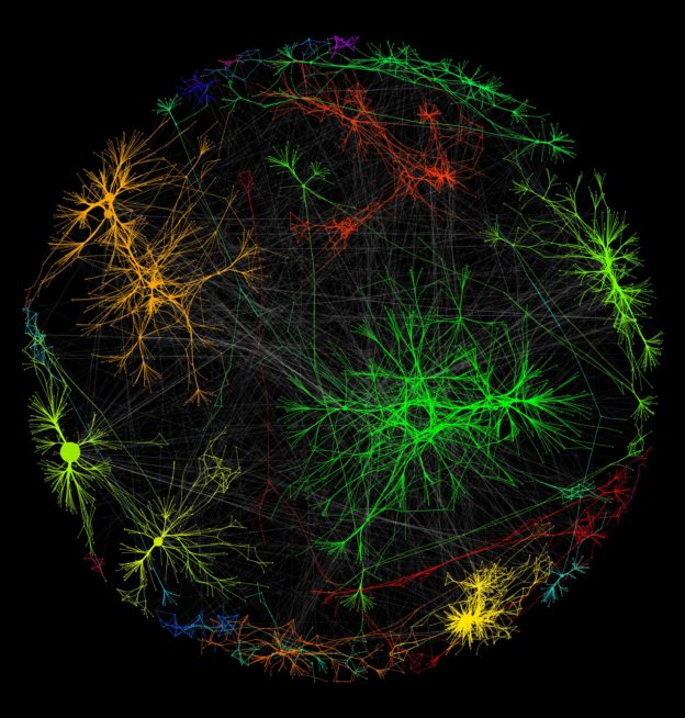
Cytoscape! It is “an open source software platform for visualizing molecular interaction networks and biological pathways and integrating these networks with annotations, gene expression profiles and other state data.” In my case, I used it to visualize data about the race/ethnicity of people killed by law enforcement in 2015. The data comes from The Counted, a platform dedicated to counting the number of people who died at the hands of police and other law enforcement agencies.
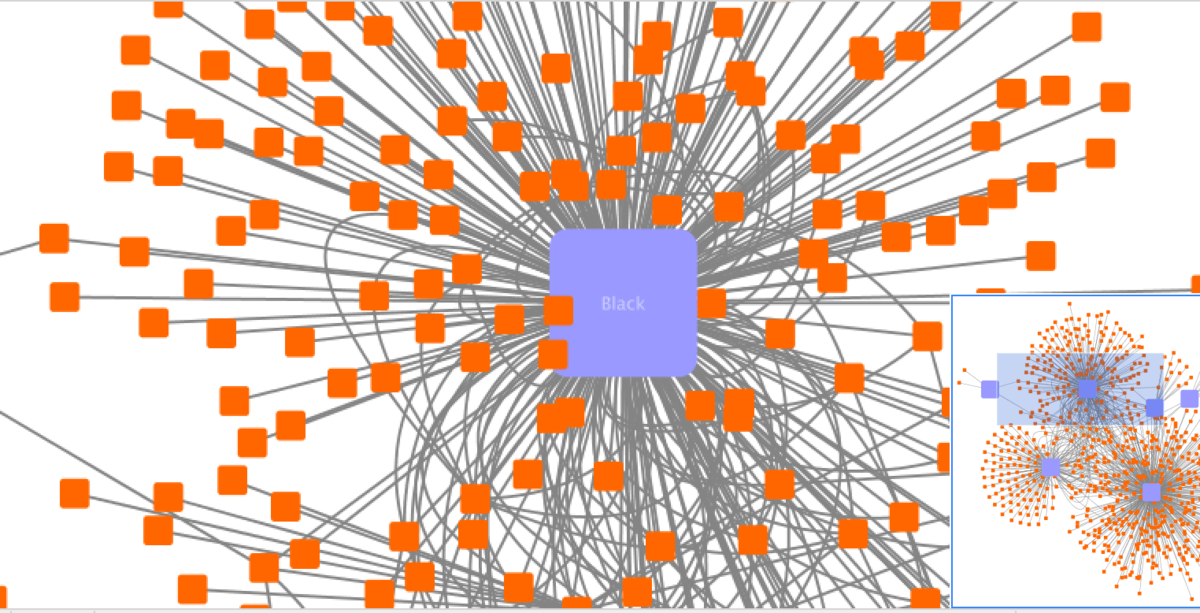
Cytoscape is very useful because you can customize different values, and manipulate things like size, color, label, etc. For this assignment, I was instructed to make the law enforcement nodes smaller (the orange nodes), and the race/ethnicity nodes larger (the purple nodes). This instruction made me think about how important the way that data is presented is. The way that data is presented can express a lot about the people who gathered the data, and their motives.
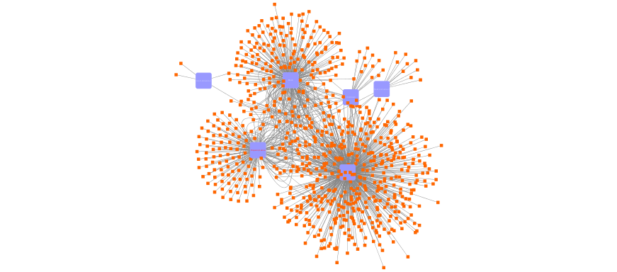 As you can see here, the race/ethnicity nodes are surrounded by the law enforcement nodes. From a purely visual standpoint even before someone understands what is going on in this visualization, they might say, “wow, there are a lot of those orange squares surrounding those purple ones,” which is completely true, and striking. After getting the data, the question is why are these groups being targeted/not being targeted by law enforcement? Putting the data into Cytoscape gave me a way to see which people (grouped by race) were killed by law enforcement in 2015. It is up to me to make sense of this, and figure out if the number of people killed seems proportionate to the number of that group as a whole in the US or if it seems disproportionate. I still have analyzing to do, but I have a solid foundation to start with.
One response to “Cytoscape & The Counted”
Hi Amara, How does your 2015 network visualization compare to the 2016 one we did in class together? You’re right to observe that the visualization isn’t the analysis. You also have an idea that is worth pushing on, I think. You say, “[t]he way that data is presented can express a lot about the people who gathered the data, and their motives.” In this case, the presentation of the data in Cytoscape was shaped by you and by the program, but the data was gathered by a different project group. Can you clarify what you meant by that comment? What in the presentation is evidence that we can use to better understand those who gathered it? Thanks!