I found this practicum very interesting in how we used a bioinformatics tool that visualizes molecular interactions for a humanities and social justice project.
According to Miriam Posners article on Cytoscape, you can visualize any information in the format of subject-verb-object. For example: Katy eats cake. Julia eats cake. Katy eats ice cream.
This would give me a cute and connected little network.
In this exercise there was no cake eating, by a more serious matter of police brutality. The Counted, a site that tracks the number of people killed by the police, has information accessible which we can transform into a subject-verb-object function and map in Cytoscape. This format ends up looking like [police station] [classification of murder] [race/ethnicity]. The goal of this data visualization I assumed was to try and investigate if there were any visual patterns into who was being murdered by the police.
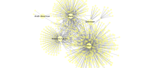
2015: Posted in header
2016: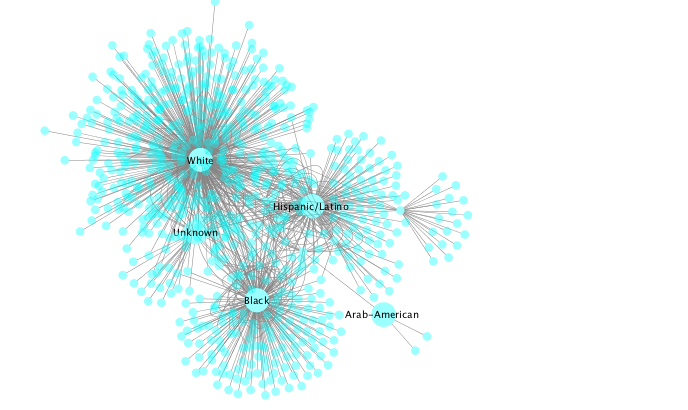
I thought that both years of visual data looked pretty similar to each other. The biggest difference between each cloud of nodes was the number of curved lines twisting around them. I think that each of the biggest circles represents each race/ethinicity as target, and each of the smaller ones represent a police station… So, these curved lines mean to me that some stations have targeted multiple different races. It also looks like stations targeting multiple white people mostly stuck to the white demographic. There is a bigger cloud around the white target area, meaning more white people were targeted but this is most likely because they are a majority to begin with.
I’m not sure what to do with the information that Cytoscape gives me. Perhaps this is my rationalization as part of a white majority, but numbers and data don’t represent to me a pattern in police shootings as if they are supposed to indicate a racism or bias. This is because even if some stations seem to be shooting more races that aren’t white, it could be the demographic of where their station and boundaries are located. I do believe that there is an inherent bias in police officers where they are more likely to shoot to kill in a racist reaction, this is primarily because of what am I seeing in the media these days. But the way to analyze and come to this resolution is not from pure data but in case studies on those particular events. A “close reading”, if you will.
One response to “The Counted Cytoscape network”
I think your analysis does a very good job of starting to analyze but stopping before drawing concrete conclusions because more study is, indeed, needed — certainly some close reading to accompany the distant reading. Your point about the lens that the media offers us for looking at visualizations like this is a very good one. We’re told how to interpret information like this — white cops shoot black men — yet, here we have a chance to take some “raw” data from The Counted and draw our own conclusions. You’re right that we need more information regarding the location of stations, specifics for individual scenarios, and an understanding of the differing ratios of different ethnicities populations and percentage of victims.