Category: Data & Visualization
-
CCSWG18 Week 2 Write-Up: Critical + Creative Coding
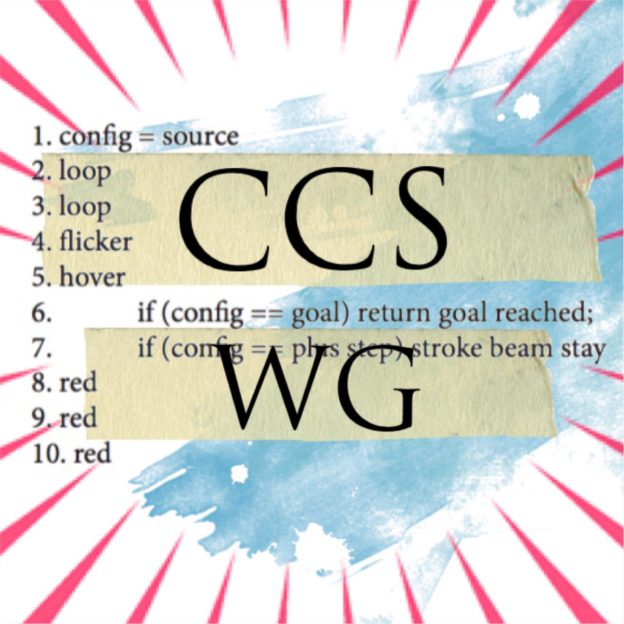
WEEK 2: CRITICAL + CREATIVE CODING by Teddy Roland Week 2 Threads: Week 2: Creative and Critical Coding (Main thread) Week 2: Creative and Critical Coding. Coding as Method? Week 2: Critical and Creative Coding – Calvinball and Coders Week 2: Poetry as Code? Code as Poetry Week 2: Rando by Ben Grosser (Code…
-
Our Mobility, A Research Project
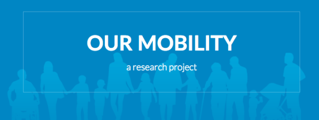
Our mobility—whether it’s walking to a corner store, commuting by bus, driving across town, or flying across the globe—says something about our social advantages and disadvantages, culture, geography, goals, responsibilities, health, and well-being. Learning about the diversity of our mobile lives is one of the motivations behind my research project, Our Mobility. For some people,…
-
Call for Papers: IEEE International Conference on Big Data
The workshop will be held on Wednesday, December 13, 2017 in Boston, MA, USA, in conjunction with the 2017 IEEE International Conference on Big Data (IEEE BigData 2017)[cci.drexel.edu]. See call for papers at: http://dcicblog.umd.edu/cas/ieee_big_data_2017_cas-workshop/[dcicblog.um… ***** Submission Deadline: October 10, 2017 ***** The large-scale digitization of analog archives, the emerging diverse forms of digital records and…
-
On the implications of multimodal research for ethnography– and for the environment

As a social scientist and scholar, I see the emergence of digital or multimodal dissertations— traditionally researched and developed theses, which are published electronically and enhanced by audio files, video segments and even infographics generated from the research data—as platforms that expand the accessibility, timeliness and utility of graduate research for a broader global community.…
-
Data Visualization in R: ggplot, plotly, googleVis and igraph overview

My recent workshop on Visualization in R. There are four different packages in R to visualize data: ggplot2, plotly, googlevis, igraph. In this hands-on workshop you will learn some basics of each package. Slides: https://www.slideshare.net/obscrivn/r-visualization-ggplot2-googlevis-plotly-igraph-overview Data set: http://tutorials.iq.harvard.edu/R/Rgraphics/dataSets/landdata-states.csv (image credit: https://community.uservoice.com/blog/data-visualization-best-practices/)
-
Data Visualization: Introduction to Shiny Web Applications
With the growing interest in interactive web applications for data visualization, the mastery of reactive frameworks, such as Shiny, becomes a valuable skill set in data science and digital humanities. Shiny is the analytical dashboards package created by R Studio, one of the key promoters and developers of R. It allows for rapid prototyping and deployment…
-
Cytoscape and customizing your network
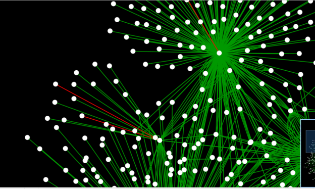
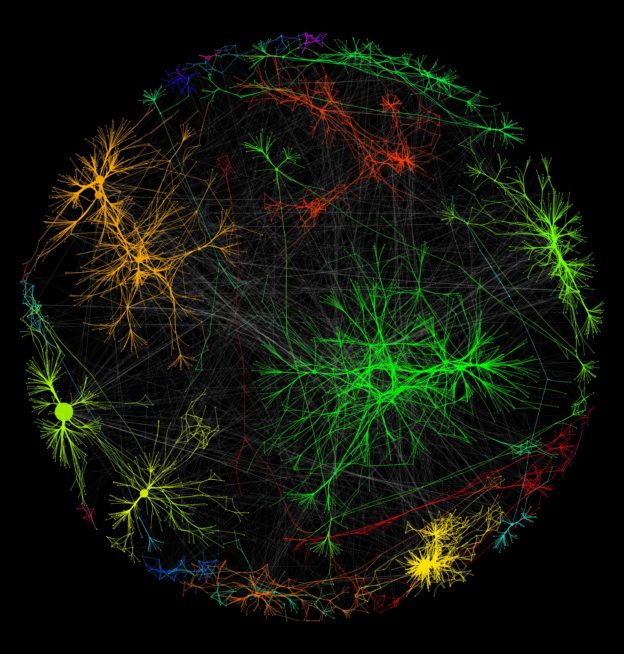
“Cytoscape is an open source and [Java-based] software for integrating biomolecular interaction networks with high-throughput expression data and other molecular states into a unified conceptual framework” (Shannon 2498). It uses graph theory for modeling and rendering to display interactive graphs. This application is very professional with a lot of features and requires good knowledge of Data analysis…
-
Cytoscape & The Counted
Cytoscape! It is “an open source software platform for visualizing molecular interaction networks and biological pathways and integrating these networks with annotations, gene expression profiles and other state data.” In my case, I used it to visualize data about the race/ethnicity of people killed by law enforcement in 2015. The data comes from The Counted, a platform dedicated to…
-
The Counted Cytoscape network
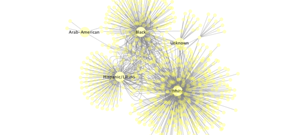
I found this practicum very interesting in how we used a bioinformatics tool that visualizes molecular interactions for a humanities and social justice project. According to Miriam Posners article on Cytoscape, you can visualize any information in the format of subject-verb-object. For example: Katy eats cake. Julia eats cake. Katy eats ice cream. This would give…